When it comes to creating custom packaging for your products, choosing the right colours is a crucial aspect. Colours have a significant impact on how consumers perceive and interact with your brand.
They can evoke emotions, create associations, and influence purchasing decisions. Therefore, it’s essential to carefully consider the colours you use in your packaging design. In this article, we’ll explore some tips and best practices for selecting colours for your custom packaging.
Consider Your Brand Identity
The colours you use in your packaging should reflect your brand identity and values. Think about your brand’s personality, mission, and target audience. What do you want your packaging to communicate about your brand? Are you a fun and playful brand, or do you want to convey professionalism and reliability?
If you’re not sure where to start, take a look at your logo and brand colours. Your packaging should complement your existing branding elements and be consistent with your overall visual identity.
Consider Your Target Audience
Your target audience plays a significant role in determining the colours you use in your packaging. Different colours can appeal to different demographics and evoke different emotions.
For example, bright and bold colours may be more appealing to younger audiences, while muted and neutral colours may be more attractive to older demographics.
Think about the age, gender, interests, and preferences of your target audience when choosing colours for your packaging. You may also want to consider the cultural and regional context in which your products will be sold.
Use Color Psychology
The study of how colours affect human behaviour and emotions is known as colour psychology. Different colours can evoke different emotions and associations, making them a powerful tool in marketing and branding.
By using colour psychology in your packaging design, you can create a powerful visual impact and communicate your brand message effectively.
Here are some examples of how different colours can affect consumer perceptions:
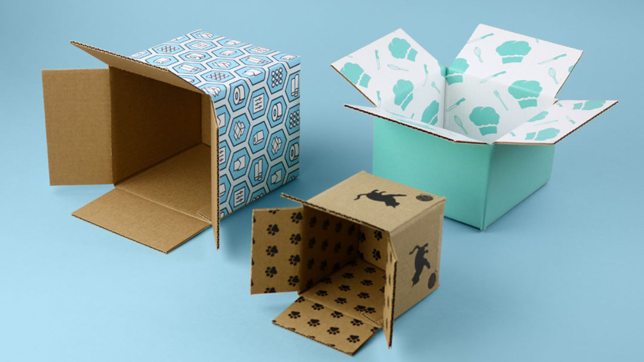
Red: Red represents passion, energy, and excitement. It can create a sense of urgency and stimulate appetite. It’s often used in food and beverage packaging.
Blue: Blue is associated with calmness, trust, and security. It’s often used in healthcare and technology packaging.
Green: Green represents nature, growth, and harmony. It’s often used in eco-friendly and sustainable packaging.
Yellow: Yellow is associated with happiness, optimism, and warmth. It can be attention-grabbing and is often used in children’s products.
Purple: Purple is associated with luxury, creativity, and spirituality. It can be used in high-end products and cosmetics.
Orange: Orange is associated with enthusiasm, creativity, and affordability. It’s often used in promotional packaging and discounts.
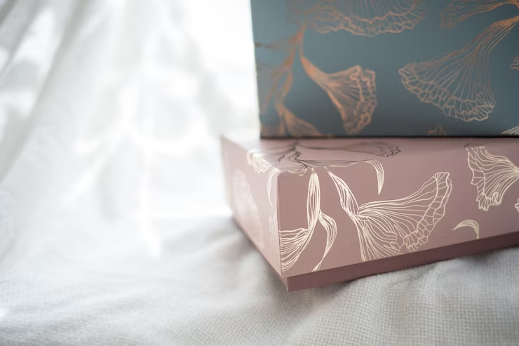
Use a Color Scheme
Once you’ve decided on the colours you want to use, it’s essential to create a cohesive colour scheme. A colour scheme refers to a set of colours that work together harmoniously. By using a colour scheme, you can create a visually appealing and memorable design that stands out on the shelves.
There are several colour schemes you can use, including complementary, analogous, and monochromatic. Here’s a brief overview of each:
Complementary colours are those that are opposite each other on the colour wheel, for example, red and green or blue and orange. They create a high-contrast, eye-catching effect.
Analogous: Analogous colours are adjacent to each other on the colour wheel, such as blue and green or yellow and orange. They create a harmonious, calming effect.
Monochromatic: Monochromatic colours are variations of the same hue, such as light blue, medium blue, and dark blue. They create a sophisticated, elegant effect.
Choose the Right Color Combination
When choosing a colour combination for your packaging, it’s essential to consider the hierarchy of colours. The hierarchy of colours refers to the order in which colours are used in a design,
The most important colour in your packaging design should be the dominant colour, which is the main colour that you want to use to represent your brand.
This colour should be prominent and easily recognizable, making it easy for consumers to associate it with your products.
Next, consider using an accent colour, which is a secondary colour that complements the dominant colour. Accent colours can be used to highlight important features or information on your packaging, such as product names or slogans.
Finally, consider using neutral colours, such as white, black, or grey, to balance out the dominant and accent colours. Neutral colours can be used as backgrounds or to add contrast to the design.
Test Your Color Choices
Before finalizing your packaging design, it’s a good idea to test your colour choices with your target audience.
Conducting surveys or focus groups can help you determine how consumers perceive your packaging and whether the colours you’ve chosen are effective in communicating your brand message.
You can also test different colour combinations by creating mock-ups or prototypes of your packaging design.
This can help you visualize how the colours will look in a real-world setting and make any necessary adjustments before going into production.
Consider Production Constraints
When selecting colours for your custom packaging, it’s essential to consider the production constraints that may impact your colour choices. For example, if you’re using digital printing, your colour choices may be limited by the printer’s colour gamut.
Similarly, if you’re using a specific type of packaging material, such as brown kraft paper, your colour choices may be limited by the natural colour of the material.
Consult with your packaging manufacturer or printer to understand the colour limitations and make sure that the colours you choose can be accurately reproduced in the final product.
Conclusion
Selecting the right colours for your custom packaging is a critical aspect of your branding and marketing efforts.
By considering your brand identity, target audience, colour psychology, colour schemes, the hierarchy of colours, and production constraints, you can create a visually appealing and effective packaging design that stands out on the shelves and resonates with your consumers.
Remember to test your colour choices and consult with experts in the packaging industry to ensure that your final product is of the highest quality.